Best art work for a prog album cover
Printed From: Progarchives.com
Category: Progressive Music Lounges
Forum Name: Prog Music Lounge
Forum Description: General progressive music discussions
URL: http://www.progarchives.com/forum/forum_posts.asp?TID=926
Printed Date: March 08 2025 at 19:12
Software Version: Web Wiz Forums 11.01 - http://www.webwizforums.com
Topic: Best art work for a prog album cover
Posted By: The Prognaut
Subject: Best art work for a prog album cover
Date Posted: June 01 2004 at 22:30
|
I think my favorite is Mark Wilkinson's illustration cover for "Fugazi". Anyways, what you all think??? javascript w'/audio/audiom/Marillion_-_Fugazi_-_Front.jpg'; - javascript w'/audio/audiom/Marillion_-_Fugazi_-_Front.jpg'; - ------------- break the circle reset my head wake the sleepwalker and i'll wake the dead |
 Fish actually contributed as well with the concept for that cover. But what I like the most is that besides containing the characteristics every Marillion Fish's era's album got, it also holds such powerful 80's images perfectly scattered all across the hotel room where it takes place (the furniture, the pictures on the wall by Julie Hazelwood, the TV set...), and of course, as in "Script for a Jester's Tear"; the hidden album covers on the floor, this time featuring Mr. Peter Hammill's "Over" and "Fools Mate" album covers I believe and the others I can't recognize...
Replies:
Posted By: moonchild
Date Posted: June 01 2004 at 22:51
I like the artwork for King Crimson > Lizard. Lots of detail. ------------- In the Wake of Poseidon |
Posted By: Aaron
Date Posted: June 02 2004 at 00:06
|
i like Yes' Relayer Aaron |
Posted By: The Prognaut
Date Posted: June 02 2004 at 02:00
|
Yeah, most of KC's front covers are quite intriguing... ------------- break the circle reset my head wake the sleepwalker and i'll wake the dead |
 moonchild wrote:
Posted By: Vibrationbaby
Date Posted: June 02 2004 at 03:20
|
Grobschnitt Rockpommell's Land and Solar Music Live. Gentle Giant In A Glass House and The Roger Dean Octopus Cover as well as Demons And Wizards by Uriah Heep. His cover for the Danish band Midnight Sun album Walking Circles is also great. Check it out on my web-site. I tis a mega rare album and is worth $ to collectors. I have mint copy which I do not even play. I burned it on to a CD.Even though I am not to fond of the record, Focus' Mother Focus album artwork is quite remarkable.Guru Guru Dance Of The Flames, also check that out on my web-site, amazing photography. Another very rare album. Omega, 200 Years After The Last War as well as Hall Of Floaters In The Sky. |
Posted By: Vibrationbaby
Date Posted: June 02 2004 at 03:21
|
Posted By: The Prognaut
Date Posted: June 02 2004 at 03:29
Still, it's KC we're talking 'bout here, so I think we can let that one slip, huh? ------------- break the circle reset my head wake the sleepwalker and i'll wake the dead |

Posted By: The Prognaut
Date Posted: June 02 2004 at 03:43
Great couple of selections and great albums BTW "Jumbo" is also one of those album covers to remember, a very eclectic yet funny one ------------- break the circle reset my head wake the sleepwalker and i'll wake the dead |

Posted By: Vibrationbaby
Date Posted: June 02 2004 at 04:35
|
Posted By: diddy
Date Posted: June 02 2004 at 06:08
|
Hmmm I really like the Foxtrot Cover, it's really funny I think...
but there are lots of really cool cover-artworks just like Lizard, Brain Salad Surgery, In a glass house or Pawn Hearts by VdGG. I also like Travis Smith, he did artwork for Opeth or Anathema. ------------- If liberty means anything at all, it means the right to tell people what they do not want to hear... George Orwell |
Posted By: Dick Heath
Date Posted: June 02 2004 at 06:50
|
The 1st Renaissance sleeve - "The Fall of Icarus" for relative sublety - but you need the the original 12" cover to appreciate it. Man's "Be Good To Yourself At Least Twice A Day" (but the original 12" sleeve, for an amazing foldout map/cartoon of Wales. Touch (again the 12") for the insert poster |
Posted By: DoomHammer
Date Posted: June 02 2004 at 07:44
The best cover i've ever seen is that of Jaz Coleman - Kashmir: Symphonic Led Zeppelin i spent more than an hour looking at it, the drawings were making averything in life out of books, buildings of books, fountain of books. it was very artistic actually. though it is not prog. i cant think of a specified prog album right now, maybe i should go take a look again  ------------- when i sell my life story, maybe i should write it first and do the living later 'cause life is so much cleaner on the page |
Posted By: Cesar Inca
Date Posted: June 02 2004 at 08:39
|
HI, THIS IS CÉSAR INCA. How about a cover in the shape of a massively satyrical newspaper? Yes, I'm talking about JETHRO TULL'S 'Thick as a Brick'. Regards. |
Posted By: arqwave
Date Posted: June 02 2004 at 12:35
|
i've seen this post previously... and i think that over the years and over the "tastes" we must achive a certain degree of respect, because the artwork is "the face" of the record, so, i think that most of the covers of Strom Thorgerson, and Bill Smith studio are worth talking about, also, i know that so many people in here admire Roger dean, but to my point of view, those drawings are excellent but to "dated", anyway, is my point of view, to me one of the must impresive covers i've seen is the "in absentia" record from Porcupine tree, a very raw and dramatic cover, or the cover for Peter gabriel's "up", cheers peace |
Posted By: Aquarius
Date Posted: June 02 2004 at 14:16
|
Knight Area - The sun also rises. (By Mattias Norén) ------------- Download 6 min. TRAILER (10 excerpts) of our upcoming concept album at http://www.silentagreement.nl - http://www.silentagreement.nl |
Posted By: Easy Livin
Date Posted: June 02 2004 at 15:33
|
Anything by Roger Dean does it for me, I've even in the past taken the fact that he designed the cover as a recommendation of the music. Cesar, you're absolutely right about TAAB, it must be the only sleeve which lasts longer than the album when you sit down and read it! It's intersting how with the demise of LPs, sleeve designs had to change. With the restricted area of a CD cover, would the likes of the covers Roger Dean designed for Yes have had nearly the same impact today? Nowadays, it's more about close ups, and less about landscapes. I notice some of Spock's Beard and the Flower Kings earlier works have been released on CD in limited edition 7 inch covers, which look like small LP sleeves which show off the artwork much better. Hopefully this is something record companies will do more often. How about re-releasing "Yessongs" in remastered format on CD, but packaged in the original LP sized double gatefold sleeve? |

Posted By: Marcelo
Date Posted: June 02 2004 at 15:41
| If you let me consider Rhapsody as a prog band, "Legendary Tales" art work is stunning! |
Posted By: lucas
Date Posted: June 02 2004 at 15:52
|
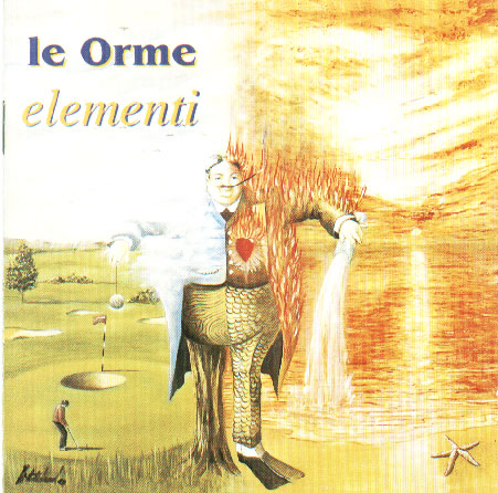
I like very much this cover artwork, but nonetheless I don't know who painted it. But I like also the following artists : Roger Dean (the red dragon, Steve Howe's cover art for "Not necessarily acoustic" is awesome) Paul Whitehead (Peter Hammill's "Fool's mate" has a sublime cover, see also Le Orme's last LP : "Elementi") Kim Poor Peter Cross (the painter for Anthony Phillips) Mark Wilkinson (see my avatar) Peter Woodroffe (Pallas' "The sentinel") J. B. Mathingly (Jordan Rudess'"Feeding the wheel")
------------- "Magma was the very first gothic rock band" (Didier Lockwood) |

Posted By: lucas
Date Posted: June 02 2004 at 15:56
Great cover and great album, as were the two following. ------------- "Magma was the very first gothic rock band" (Didier Lockwood) |
Posted By: Ashane
Date Posted: June 02 2004 at 18:45
|
Fates Warning - Awaken the Guardian
Dream Theater - Awake Zero Hour - Metamorphosis ------------- http://www.mindsetweb.tk/ |
Posted By: The Prognaut
Date Posted: June 02 2004 at 19:05
|
Is that even art work? DT's "Awake" cover is very proggy and unique, impressive if you like (what's with the cobweb and the spider at the bottom right corner of that cover BTW) ... but that's just digital photography... Well, that's just me! ------------- break the circle reset my head wake the sleepwalker and i'll wake the dead |

Posted By: The Prognaut
Date Posted: June 02 2004 at 19:10
Magnificent illustration for a wonderful album... almost as surreal as Polish painter's Witkacy in his piece "Rbanie lasu. Walka.", just saying they kinda look alike from the same sort of art trend... well, I don't know much 'bout art, I just know I love this "Le Orme" album cover ------------- break the circle reset my head wake the sleepwalker and i'll wake the dead |
Posted By: raleighgranprix
Date Posted: June 03 2004 at 00:12
|
I believe the painter, artist is Winslow Homer, American Classic, http://images.amazon.com/images/P/B00000252H.01.LZZZZZZZ.jpg - http://images.amazon.com/images/P/B00000252H.01.LZZZZZZZ.jpg that Kansas puts on the cover and Masque by the same group are good covers. Not necessarily my favourite covers to look at if I'm at home, I will pull various KC albums out. If you did not know, the original "Stand Up" by Jethro Tull, you open up, and like some greeting cards, band figurines stand up, I never noted the parallel that this has with Benefit; the cut out stand ups on that cover. Oh, and in this thread or one of the others, one mentioned Led Zeppelin. How interesting, that Hipgnosis, designed some Floyd Covers, WYWH, wish you were here, comes to mind. Zep's Presence and all of those accompanying photos are pretty cool, very striking. http://www.sound.jp/hipgnosis/yapwall/yhip.html - http://www.sound.jp/hipgnosis/yapwall/yhip.html Hipgnosis gallery, sans Presence, too much to read, maybe the same company did "a nice pair" as well, maybe not mentioned in the PF catalog; if it was a release of two previous PF releases.
------------- "You well heeled big wheel, ha ha, charade you are ... and do you feel abused, down in the pig mine, you're nearly a laugh but you're really a cry ......- PF |
Posted By: The Prognaut
Date Posted: June 03 2004 at 00:21
Awesome selection! Thanx for the URL's BTW ------------- break the circle reset my head wake the sleepwalker and i'll wake the dead |

Posted By: lucas
Date Posted: June 03 2004 at 06:42
"Rabanie lasu". I posted a reproduction of this painting in one of the art threads of the "discussions not related to music" page. Witkacy (Stanislaw Witkiewicz) is one of my favourite contemporaneous painters. Moreover he comes from the same country as me (i. e. Poland, although my parents left this country while I was 2 years old, I am very attached to it). ------------- "Magma was the very first gothic rock band" (Didier Lockwood) |
Posted By: The Prognaut
Date Posted: June 03 2004 at 13:22
Thanx Lucas, I'll certainly go check out that post of yours, it's been way too long since the last time I looked at that painting... ------------- break the circle reset my head wake the sleepwalker and i'll wake the dead |

Posted By: DoomHammer
Date Posted: June 03 2004 at 14:29
|
Have you seen the drawings in SAVATAGE - Tha Wake of Magellan ? there are some black and white hand drawings that are great ------------- when i sell my life story, maybe i should write it first and do the living later 'cause life is so much cleaner on the page |
Posted By: Menswear
Date Posted: June 03 2004 at 15:07
|
Gentle Giant----Acquiring the taste The flesh licking...but it's not! Provocative. Spock's Beard---The Light Enigmatic, cartoonesque and does'nt relate to the album! That's clever! Rush---Exit Stage Left Ambitious (front and back concept), playful, the picture's texture is soft and relaxing Rush---Moving Pictures Feeling of depht well played, great pun, kinda Russian Genesis---A trick of the Tail Classical, stylish and great cartoon drawing relating to the songs Triumvirat---Spartacus & Illusion on a Double Dimple The rat concept...too cute! Caravan---In the Land of Grey and Pink Inviting, warm, peaceful, Tolkienesque and soooo pink. |
Posted By: raleighgranprix
Date Posted: June 03 2004 at 20:59
|
It is a beautiful remarkable painting; airbrush? well, only letting you know, 3rd generation in America Polish ancestry ... that's all.
------------- "You well heeled big wheel, ha ha, charade you are ... and do you feel abused, down in the pig mine, you're nearly a laugh but you're really a cry ......- PF |
Posted By: Dan Bobrowski
Date Posted: June 03 2004 at 21:07
Second Generation, http://www.smileycentral.com/?partner=ZSzeb001"> RPG RPGhttp://www.smileycentral.com/?partner=ZSzeb045"> |
Posted By: raleighgranprix
Date Posted: June 03 2004 at 21:20
|
Cheers, the best to you Danbo. In fact, I speak a second language, I learned in the Southwest United States, Spanish, I translate that some, in my work. Just here, I will say, I really like all languages, I've seen about. But in college, the juices flowed good to learn, now, sort of motivational problems. To another album cover, well, the cover is good, but I am impressed, especially, if it is "album" sized, is the inside of Trilogy- ELP, I guess, those are real trees, real autumn leaves and all that, but it has always struck me as really fantastic, just short of surreal and 15 years, later after first seeing it, or whenever that was ... it seems even more spectacular. Any input is welcome on that comment. Those trees, look out of this world, but surely are real trees, of Nottingham forest or somewhere. Of course, that one Jeff Beck album, does have a Rene Magritte painting of a large apple, that's good too. Beck-Ola, if I am not mistaken on the name.
------------- "You well heeled big wheel, ha ha, charade you are ... and do you feel abused, down in the pig mine, you're nearly a laugh but you're really a cry ......- PF |
Posted By: Dan Bobrowski
Date Posted: June 04 2004 at 11:22
|
I like the cover of Beck's Blow by Blow and SRV's Texas Flood. Pencil drawings with the shading and slightly off vibe. Adds some depth not in a photograph.
|


Posted By: Fitzcarraldo
Date Posted: June 06 2004 at 22:03
|
Roger Dean's cover of Greenslade's s/t album is excellent, although the CD (or the copy below) does not do it justice. It's best to open the album out, as the front and back cover form one continuous picture.
and diddy mentioned the cover of ELP's Brain Salad Surgery (by HR Giger), which I agree is fabulous. I love the inside cover:
Again, you need to see the picture as large as possible to really appreciate it. If you like the above Giger picture, check out the picture on his Home Page: http://www.hrgiger.info/ - http://www.hrgiger.info/ . No wonder they got him to design the alien and the sets for Alien! The CD cover for the re-release of Brain Salad Surgery by Rhino Records has an innovation that I think is very nice: the plastic cover of the Jewel Case is ridgy; a bit like those postcards which, if you tilt them, display a different view. When you tilt the CD case you see a similar effect to opening the original LP cover. Clever. I wish more record companies were like Rhino.
|


Posted By: The Prognaut
Date Posted: June 07 2004 at 01:33
|
Lucas: Do you think that the artist behind Le Orme's "Uomo Di Pezza" front cover could be the same one involved in the art regarding "Il Fiume" and "Elementi" Paul Whitehead??? Regards, Land ------------- break the circle reset my head wake the sleepwalker and i'll wake the dead |

Posted By: lucas
Date Posted: June 07 2004 at 13:12
No, I don't think. RGP said it could be Winslow Homer. BTW, I liked very much "Elementi". What does "Il fiume" sound like ? ------------- "Magma was the very first gothic rock band" (Didier Lockwood) |
Posted By: The Prognaut
Date Posted: June 07 2004 at 19:35
|
This was certainly painted by Paul Whitehead! and so was "Il Fiume" front cover... regarding that last album lucas, it's got mostly the "Felona e Sorona" formula plus what the band did in its album "Ad Gloriam". Obviously overshadowed by "Elementi" and "Uomo di pezza", but Il Fiume is a extremely well composed piece of work... definitely a must! Like you said, if you enjoyed "Elementi" and love "F&S", you will appeal to this record BTW, I heard from a very reliable source ------------- break the circle reset my head wake the sleepwalker and i'll wake the dead |
Posted By: raleighgranprix
Date Posted: June 08 2004 at 20:30
|
You know, who has some very fine album covers, http://home.ca.inter.net/~suth/trower/classic.html - http://home.ca.inter.net/~suth/trower/classic.html Robin Trower, look at those 3 studios on that page, played for Procol Harum, I have never looked to see if he is included on this site. I'm sure, he has good music, described as a "white Hendrix" and friends of mine listen to him, but I don't know his music very well, except for bits here and there.
------------- "You well heeled big wheel, ha ha, charade you are ... and do you feel abused, down in the pig mine, you're nearly a laugh but you're really a cry ......- PF |
Posted By: Mysterio
Date Posted: June 09 2004 at 00:38
|
I think Close To The Edge has the best and most intricate
design ever. *laugh track* Seriously, though, the inside cover of CttE and Relayer are both really, really good. And Fragile. Genesis' artwork is all hilarious. Well, the PG stuff, anyways. ------------- "YOU SLEPT WITH MY WIFE!?" "It was a threesome! ... Nobody slept!" |
Posted By: Dan Bobrowski
Date Posted: June 09 2004 at 01:10
|
Bridge of Sighs is a brilliant work. Some great slow building epics, as well as hard rockers. IT's one of my favorite Non-Prog albums. One of those timeless wonders. |
Posted By: Fitzcarraldo
Date Posted: June 09 2004 at 06:08
|
lucas, landberkdoten, The cover of Uomo Di Pezza was painted by the Italian artist Walter Mac Mazzieri. It's an oil painting called Garbo Di Neve and you can see the cover on his Web site here: http://www.macmazzieri.com/garbodineve.html - http://www.macmazzieri.com/garbodineve.html You can enjoy some of his other paintings on that site too. |

Posted By: Fitzcarraldo
Date Posted: June 09 2004 at 06:15
|
danbo said: "Bridge of Sighs is a brilliant work." Absolutely. Had completely forgotten about Trower and Bridge Of Sighs, not having listened to it for 30 years. Now I'm getting itchy to get hold of it again! |
Posted By: raleighgranprix
Date Posted: June 09 2004 at 08:34
|
In a way, it is like Salvador Dali, though as in the second painting that was placed, the man, looks the way, we are accustomed of thinking that Italians look.
------------- "You well heeled big wheel, ha ha, charade you are ... and do you feel abused, down in the pig mine, you're nearly a laugh but you're really a cry ......- PF |
Posted By: Fitzcarraldo
Date Posted: June 09 2004 at 09:11
|
raleighgranprix said: "In a way, it is like Salvador Dali, though as in the second painting that was placed, the man, looks the way, we are accustomed of thinking that Italians look." You've lost me there, I'm afraid! I don't think Italians look like that!
|

Posted By: raleighgranprix
Date Posted: June 09 2004 at 11:24
|
"You've lost me there, I'm afraid! I don't think Italians look like that" - Fitzcarraldo
Maybe not looking like a Dino Baggio
http://www.macmazzieri.com/esposizioni.html - http://www.macmazzieri.com/esposizioni.html
------------- "You well heeled big wheel, ha ha, charade you are ... and do you feel abused, down in the pig mine, you're nearly a laugh but you're really a cry ......- PF |

Posted By: The Prognaut
Date Posted: June 09 2004 at 17:57
Thanx a lot Fitz! I was going slightly insane about this one Next time I have some art doubt, I will come to you Peace ------------- break the circle reset my head wake the sleepwalker and i'll wake the dead |