Progarchives.com has always (since 2002) relied on banners ads to cover web hosting fees and all.
Please consider supporting us by giving monthly PayPal donations and help keep PA fast-loading and ad-free forever.
/PAlogo_v2.gif) |
|
Post Reply 
|
Page 123> |
| Author | |||
Toaster Mantis 
Forum Senior Member 

Joined: April 12 2008 Location: Denmark Status: Offline Points: 5898 |
 Topic: Bands whose visual aesthetic you really like Topic: Bands whose visual aesthetic you really likePosted: March 16 2014 at 03:51 |
||
|
There are some music groups where the entire set of visual symbolism they surround themselves with (band photos, cover art, stage shows etc) are as integral to the entire "band concept" as the music, at the very least really adding something to the entire music experience.
My picks so far are:
Will add some more when I can think of them. What are your picks? |
|||
|
"The past is not some static being, it is not a previous present, nor a present that has passed away; the past has its own dynamic being which is constantly renewed and renewing." - Claire Colebrook
|
|||
 |
|||
moshkito 
Forum Senior Member 
Joined: January 04 2007 Location: Grok City Status: Offline Points: 18063 |
 Posted: March 16 2014 at 10:01 Posted: March 16 2014 at 10:01 |
||
|
Hi,
I think you want NEKTAR in this list. The 5th member was the lighting person setting up their "light theater" on the stage, which was on all sides, in the early days. If I'm not mistaken, he was also a part of the writing team for the music.
|
|||
|
Music is not just for listening ... it is for LIVING ... you got to feel it to know what's it about! Not being told!
www.pedrosena.com |
|||
 |
|||
Manuel 
Forum Senior Member 

Joined: March 09 2007 Location: United States Status: Offline Points: 13481 |
 Posted: March 16 2014 at 10:35 Posted: March 16 2014 at 10:35 |
||
|
Jethro Tull
|
|||
 |
|||
Toaster Mantis 
Forum Senior Member 

Joined: April 12 2008 Location: Denmark Status: Offline Points: 5898 |
 Posted: March 16 2014 at 10:51 Posted: March 16 2014 at 10:51 |
||
|
Not sure how exclusively visual their aesthetic, but the band concept of Jethro Tull is indeed one of my favourite things about the band: The entire collison between traditional and modernity, specifically the rather witty commentary in the lyrics and how you see it reflected in the songwriting's combination of folk music and progressive rock.
|
|||
|
"The past is not some static being, it is not a previous present, nor a present that has passed away; the past has its own dynamic being which is constantly renewed and renewing." - Claire Colebrook
|
|||
 |
|||
dr wu23 
Forum Senior Member 

Joined: August 22 2010 Location: Indiana Status: Offline Points: 20660 |
 Posted: March 16 2014 at 11:23 Posted: March 16 2014 at 11:23 |
||
|
For me Yes had that going with Fragile, CTTE, TFTO and Relayer with the Roger Dean logo and artwork.
The first 3 Crimson had that with their lyrical and artwork ideas and Genesis with Trespass, Foxtrot, and Nursery Cryme had a mystical old English 'feel' that seemed to be consistent.
|
|||
|
One does nothing yet nothing is left undone.
Haquin |
|||
 |
|||
Horizons 
Collaborator 

Honorary Collaborator Joined: January 20 2011 Location: Somewhere Else Status: Offline Points: 16952 |
 Posted: March 16 2014 at 12:14 Posted: March 16 2014 at 12:14 |
||
|
Mastodon's artwork up to and including CtS is simply brilliant. Unfortunately the artist died and The Hunter received a different artist.
The love the usage of the same style throughout their discog and the detail put into them. They aren't the cliche metal artwork. |
|||
|
Crushed like a rose in the riverflow.
|
|||
 |
|||
HemispheresOfXanadu 
Forum Senior Member 

Joined: June 28 2012 Location: Canada Status: Offline Points: 4339 |
 Posted: March 16 2014 at 12:48 Posted: March 16 2014 at 12:48 |
||
|
Opeth. Generally very dark album covers (not in the typical death metal sense of guts and gore) but still very organic even if there's nothing living on the album art itself thanks to their stylized name.
|
|||
|
@ProgFollower on Twitter. Tweet me muzak.
|
|||
 |
|||
Prog 74 
Forum Senior Member 

Joined: March 16 2014 Location: USA Status: Offline Points: 171 |
 Posted: March 16 2014 at 16:18 Posted: March 16 2014 at 16:18 |
||
|
Yes circa 71-74 with those incredible Roger Dean album covers.
|
|||
 |
|||
KingCrInuYasha 
Forum Senior Member 
Joined: September 26 2010 Location: USA Status: Offline Points: 1281 |
 Posted: March 16 2014 at 16:19 Posted: March 16 2014 at 16:19 |
||
|
Black Sabbath with their first two albums. It's like a twisted cross between a Marvel comic and an episode of The Twilight Zone.
|
|||
|
He looks at this world and wants it all... so he strikes, like Thunderball!
|
|||
 |
|||
MFP 
Forum Senior Member 
Joined: March 31 2009 Status: Offline Points: 9433 |
 Posted: March 16 2014 at 16:19 Posted: March 16 2014 at 16:19 |
||
|
Iron Maiden
Maiden England World Tour:  Edited by MFP - March 16 2014 at 16:26 |
|||
 |
|||
Polymorphia 
Forum Senior Member 

Joined: November 06 2012 Location: here Status: Offline Points: 8856 |
 Posted: March 16 2014 at 17:03 Posted: March 16 2014 at 17:03 |
||
|
Like: Grizzly Bear, Swans, post-Meddle Pink Floyd, maudlin of the Well
Dislike: Different strokes for different folks sure, but I would rather not stroke or be stroked by late-70s prog naked-man-butts. |
|||
 |
|||
King Crimson776 
Forum Senior Member 

Joined: October 12 2007 Location: United States Status: Offline Points: 2779 |
 Posted: March 16 2014 at 17:19 Posted: March 16 2014 at 17:19 |
||
|
Tool... shame about the music.
|
|||
 |
|||
notesworth 
Forum Groupie 
Joined: June 03 2010 Location: Mississippi Status: Offline Points: 98 |
 Posted: March 16 2014 at 17:26 Posted: March 16 2014 at 17:26 |
||
|
Kraftwerk's visual aesthetic always appealed to me. I don't know why.
|
|||
 |
|||
twosteves 
Forum Senior Member 

Joined: May 01 2007 Location: NYC/Rhinebeck Status: Offline Points: 4095 |
 Posted: March 16 2014 at 18:01 Posted: March 16 2014 at 18:01 |
||
didn't think of them but it appeals to me too---of course Yes and Dean--but I love Genesis covers particularly SEBTP, Lamb, Trick, W&W
|
|||
 |
|||
The Dark Elf 
Forum Senior Member 

VIP Member Joined: February 01 2011 Location: Michigan Status: Offline Points: 13227 |
 Posted: March 16 2014 at 18:26 Posted: March 16 2014 at 18:26 |
||
The time period that included Aqualung, TAAB, APP and War Child featured a visual aesthetic and concept that ran through the music, the album covers and the live presentation. I could point to the Mad Dog Fagin look of Ian Anderson coinciding with the lecherous Aqualung character, and the sublime Thick as a Brick album cover that spoofed not only the prog rock milieu, but small town newspapers and the lyrics of the song itself (featuring "Little Milton" Gerald Bostock as the poet). A film was designed specifically for A Passion Play and was shown behind the band at the concert (as well as Jeffrey Hammond-Hammond reading "The Hare that Lost its Spectacles" in an oversized chair). The War Child concept was actually being planned as a feature film (with none other than John Cleese of Monty Python as an advisor). Another rock band (band, not individual at the time) with a highly entertaining visual aesthetic was Alice Cooper. Good Lord! What fantastic shows in the early/mid 70s, all featuring a plotted story that ran along with the music, particularly the albums Love It To Death, Killer, School's Out and Billion Dollar Babies. From a musical standpoint, Alice does not get enough credit for those albums, but they were fantastic, and even a bit proggy on occasions.
|
|||
|
...a vigorous circular motion hitherto unknown to the people of this area, but destined
to take the place of the mud shark in your mythology... |
|||
 |
|||
Polymorphia 
Forum Senior Member 

Joined: November 06 2012 Location: here Status: Offline Points: 8856 |
 Posted: March 16 2014 at 19:04 Posted: March 16 2014 at 19:04 |
||
|
|||
 |
|||
JediJoker7169 
Forum Senior Member 
Joined: May 05 2009 Location: West Coast, NA Status: Offline Points: 195 |
 Posted: March 17 2014 at 01:10 Posted: March 17 2014 at 01:10 |
||
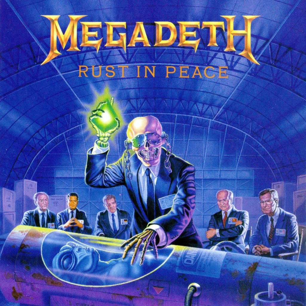
Eddie the Head! Megadeth's Vic Rattlehead:  And Judas Priest's "leather-and-studs" getup:  |
|||
 |
|||
richardh 
Prog Reviewer 

Joined: February 18 2004 Location: United Kingdom Status: Offline Points: 29415 |
 Posted: March 17 2014 at 02:21 Posted: March 17 2014 at 02:21 |
||
|
Eloy always did sci-fi concepts and the album covers were quite striking and in line with that. Not sure they had the money to make the live shows that totally immersive experience though.
|
|||
 |
|||
Chris S 
Special Collaborator 

Honorary Collaborator Joined: June 09 2004 Location: Front Range Status: Offline Points: 7028 |
 Posted: March 17 2014 at 02:27 Posted: March 17 2014 at 02:27 |
||
|
Great question, I would have to say Genesis from TOTT, W&W and ATTWT era! Ah nostalgia but for the second half of the seventies they were so perfect for the aesthetics mould

|
|||
|
...As I venture through the slipstream, between the viaducts in your dreams...[/COLOR] |
|||
 |
|||
Toaster Mantis 
Forum Senior Member 

Joined: April 12 2008 Location: Denmark Status: Offline Points: 5898 |
 Posted: March 17 2014 at 03:34 Posted: March 17 2014 at 03:34 |
||
I know it's probably some people's pet peeve about progressive music, but I really like how integral the information contained in Thick as a Brick's cover art is to understanding the music found within. See also Hawkwind's In Search of Space whose booklet contains a lengthy pamphlet outlining the central concept of that LP.
Can't believe I forgot those Teutonic gentlemen. They're like the example of a very strong central ideological concept running through everything a music group does and records. In their case it goes even beyond that and also represents a case of national cultural identity being essential to the band concept: One of Kraftwerk's stated purposes was to rehabilitate and revive all the German avant-garde cultural traditions that the NSDAP squashed in the 1930s. (hence the very retro-art deco cover art on Autobahn and Trans-Europe Express) Which reminds me, I'm not a fan of Magma but I'm surprised nobody have mentioned them yet.
You've just described how I feel about Baroness. |
|||
|
"The past is not some static being, it is not a previous present, nor a present that has passed away; the past has its own dynamic being which is constantly renewed and renewing." - Claire Colebrook
|
|||
 |
|||
Post Reply 
|
Page 123> |
| Forum Jump | Forum Permissions  You cannot post new topics in this forum You cannot reply to topics in this forum You cannot delete your posts in this forum You cannot edit your posts in this forum You cannot create polls in this forum You cannot vote in polls in this forum |