| Author |
 Topic Search Topic Search  Topic Options Topic Options
|
Mr. Maestro 
Forum Senior Member


Joined: March 05 2010
Location: Knowhere, USA
Status: Offline
Points: 918
|
 Posted: March 03 2011 at 22:16 Posted: March 03 2011 at 22:16 |
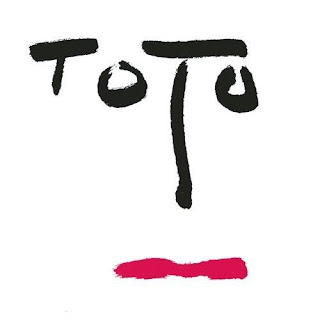
Peter Hammill has an awesome logo:
|
|
"I am the one who crossed through space...or stayed where I was...or didn't exist in the first place...."
|
 |
WalterDigsTunes
Forum Senior Member
Joined: September 11 2007
Location: SanDiegoTijuana
Status: Offline
Points: 4373
|
Posted: March 03 2011 at 22:22 |
 NecronCommander wrote: NecronCommander wrote:
IMO the Devin Townsend Project logo is one of the most brilliant ones I've seen as far as a design perspective goes.
|
Why? It's shoddy six minute CGI.
|
|
Atoms
Forum Senior Member

Joined: September 12 2010
Location: Sweden
Status: Offline
Points: 546
|
Posted: March 04 2011 at 03:02 |
|
|
|
Icarium
Forum Senior Member

VIP Member
Joined: March 21 2008
Location: Tigerstaden
Status: Offline
Points: 34086
|
Posted: March 04 2011 at 03:32 |
|
|
|
|
|
MillsLayne
Forum Senior Member

Joined: September 14 2010
Location: East Bay, CA
Status: Offline
Points: 2504
|
Posted: March 04 2011 at 07:08 |
I'm partial to the original Rush logo and even have a shirt to show it off!
And while they aren't prog in the least, I also like Foo Fighters' logo. Has a classic feel to it:
Edited by MillsLayne - March 04 2011 at 07:09
|
|
|
|
NecronCommander
Special Collaborator


Prog Metal Team
Joined: September 17 2009
Location: Madison, WI
Status: Offline
Points: 16122
|
Posted: March 04 2011 at 07:09 |
WalterDigsTunes wrote:
NecronCommander wrote:
IMO the Devin Townsend Project logo is one of the most brilliant ones I've seen as far as a design perspective goes.
|
Why? It's shoddy six minute CGI.
|
I thought the way they integrated the infinity symbol was pretty neat since it's a theme that pops up in his music a lot.
|
|
|
|
AtomicCrimsonRush
Special Collaborator

Honorary Collaborator
Joined: July 02 2008
Location: Australia
Status: Offline
Points: 14258
|
Posted: March 04 2011 at 07:53 |
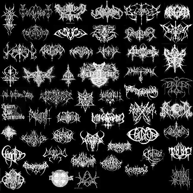
harmonium.ro wrote:
chopper wrote:
The Yes logo is my favourite.
To change the subject slightly, is it my age or do a lot of metal bands have unreadable logos these days?
|
This should go well in the "illiteracy" thread 
|
Geez it looks like a glorified butterfly collection!
I always thought that when i flick through metal Cds and it is rather strange to have illegible logos. i thought bands wanted to be known.... not black metal it seems. These logos look like art designs - symmetrically balanced and lots of Gothic touches. Not one logo above is legible... not one... weird.
Edited by AtomicCrimsonRush - March 04 2011 at 08:00
|
|
|
|
BaldJean
Prog Reviewer


Joined: May 28 2005
Location: Germany
Status: Offline
Points: 10387
|
Posted: March 04 2011 at 08:23 |
the logo of Van der Graaf Generator is quite nice  I like the Escher letters in it. I ilke the Hawkwind logo too:  
|
 A shot of me as High Priestess of Gaia during our fall festival. Ceterum censeo principiis obsta
|
|
AtomicCrimsonRush
Special Collaborator
Honorary Collaborator
Joined: July 02 2008
Location: Australia
Status: Offline
Points: 14258
|
Posted: March 04 2011 at 08:52 |
|
^^^ The Hawkwind is rather cool. Missed that one BJ
|
|
|
|
harmonium.ro
Special Collaborator
Honorary Collaborator / Retired Admin
Joined: August 18 2008
Location: Anna Calvi
Status: Offline
Points: 22989
|
Posted: March 04 2011 at 09:06 |
After Magma and YES, my third favourite probably is the modern KC logo: 
|
|
AtomicCrimsonRush
Special Collaborator
Honorary Collaborator
Joined: July 02 2008
Location: Australia
Status: Offline
Points: 14258
|
Posted: March 04 2011 at 09:14 |
|
Basic but effective I agree! ^^^
|
|
|
|
cstack3
Forum Senior Member

VIP Member
Joined: July 20 2009
Location: Tucson, AZ USA
Status: Offline
Points: 7418
|
Posted: March 04 2011 at 15:18 |
The cover of Goldmine Magazine's "Prog Rock" issue has a graphic that shows Yes, ELP, Genesis and Flash logos!
Flash had a very elegant logo, nearly art-deco in design. See:
|
|
harmonium.ro
Special Collaborator
Honorary Collaborator / Retired Admin
Joined: August 18 2008
Location: Anna Calvi
Status: Offline
Points: 22989
|
Posted: March 04 2011 at 15:23 |
An unmistakable and unforgetable one: 
|
|
lucas
Special Collaborator

Honorary Collaborator
Joined: February 06 2004
Location: France
Status: Offline
Points: 8138
|
Posted: March 04 2011 at 16:07 |

of course
|
|
"Magma was the very first gothic rock band" (Didier Lockwood)
|
|
The_Jester
Forum Senior Member

Joined: September 29 2010
Status: Offline
Points: 741
|
Posted: March 07 2011 at 08:55 |

Maybe it's not a logo but it's cool.
|
|
La victoire est éphémère mais la gloire est éternelle!
- Napoléon Bonaparte
|
|
Porcupinetheater
Forum Groupie


Joined: February 26 2011
Location: by your window
Status: Offline
Points: 54
|
Posted: March 07 2011 at 20:39 |
|
|
|
Tell a man there are 300 billion stars in the universe and he'll believe you. Tell him a bench has wet paint on it and he'll have to touch it to be sure.
|
|
Donate monthly and keep PA fast-loading and ad-free forever.
/PAlogo_v2.gif "Progarchives.com Homepage")


 Best Prog artist Logo!