| Author |
 Topic Search Topic Search  Topic Options Topic Options
|
mellors 
Forum Groupie


Joined: September 18 2007
Location: United Kingdom
Status: Offline
Points: 64
|
 Posted: November 08 2007 at 12:05 Posted: November 08 2007 at 12:05 |
Difficult to beat Iron Maiden's Dance of Death, especially considering the legacy of the other covers. Doubt any cover has had quite so much stick. 
Edited by mellors - November 08 2007 at 12:07
|
 |
jimmy_row
Forum Senior Member

Joined: July 11 2007
Location: Hibernation
Status: Offline
Points: 2601
|
Posted: November 08 2007 at 11:07 |
|
I'll have to agree about The Snow Goose, it's way too forced and mechanical. That album needed something pastoral and evokative to fit the music...the cover of Moonmadness or along those lines would have been much better.
|
|
Signature Writers Guild on strike
|
|
andu
Forum Senior Member

Joined: September 27 2006
Location: Romania
Status: Offline
Points: 3089
|
Posted: November 08 2007 at 10:57 |
I've just looked over the top 100 and the albums who would really need better covers are imo Depois do Fim (Bacamarte) Live Scenes From New-York (DT) Playing the Fool (GG) In A Glass House (GG) The Human Equation (Ayreon) Made In Japan (Deep Purple) Script For A Jester's Tear Hot Rats (Zappa) You Cant Do That On Stage Any More (Zappa) The Lamb Lies Down On Broadway A Live Record (Camel) Lateralus (Tool) Valentybe Suite (Colosseum) Snowgoose (Camel) Second Life Syndrome (Riverside) Free Hand (Gentle Giant) Barclay James Harvest Live Last Epic (ACT) Different Stages (Rush) Kronologia (Crucis) and there are a couple more of dubious ones. 
|
|
dralan
Forum Senior Member

Joined: December 29 2005
Location: United States
Status: Offline
Points: 339
|
Posted: November 08 2007 at 10:53 |
|
I was never a big fan of Paul Whitehead's artwork for the early Genesis albums. I always thought it looked very amateurish and thought they could have come up with something better.
|
|
andu
Forum Senior Member
Joined: September 27 2006
Location: Romania
Status: Offline
Points: 3089
|
Posted: November 08 2007 at 10:23 |
|
I think both are quite... err, simplistic? ...
|
|
darkmatter
Forum Senior Member

Joined: November 23 2006
Location: New Jersey
Status: Offline
Points: 2760
|
Posted: November 08 2007 at 10:19 |
|
^ I don't mind it, I think it looks fine, as is the original cover.
|
|
MikeEnRegalia
Special Collaborator


Honorary Collaborator
Joined: April 22 2005
Location: Sweden
Status: Offline
Points: 21458
|
Posted: November 08 2007 at 10:14 |
|
|
|
|
|
explodingjosh
Forum Senior Member
Joined: February 10 2007
Location: United States
Status: Offline
Points: 507
|
Posted: November 08 2007 at 09:41 |
|
If this thread has never been done before, it really needed to be. Maybe some of these artists will realize that we as prog fans actually don't like archetypal-prog-rock Wannabe Roger Dean covers.
Edited by explodingjosh - November 08 2007 at 09:42
|
|
|
|
Leningrad
Forum Senior Member

Joined: August 15 2006
Location: Canada
Status: Offline
Points: 7991
|
Posted: November 08 2007 at 09:37 |
Hmm....
I think this cover is cool, personally!
Edited by Chameleon - November 08 2007 at 10:12
|
|
explodingjosh
Forum Senior Member
Joined: February 10 2007
Location: United States
Status: Offline
Points: 507
|
Posted: November 08 2007 at 09:37 |
|
|
|
|
|
Dean
Special Collaborator

Retired Admin and Amateur Layabout
Joined: May 13 2007
Location: Europe
Status: Offline
Points: 37575
|
Posted: November 08 2007 at 09:34 |

I get surreal: a goldfish morphed intio VW camper van I get, the Taj Mahal in a fishbowl I get, artisitcally it's pretty well done and I even get the title. What I don't get is why does it look so bad? 
|
|
What?
|
|
The Doctor
Special Collaborator

Honorary Collaborator
Joined: June 23 2005
Location: The Tardis
Status: Offline
Points: 8543
|
Posted: November 08 2007 at 09:23 |
 proggy wrote: proggy wrote:
Worst Cover - Yes - Time and a Word; Do boobs and prog really go together? |
YES! 
|
|
I can understand your anger at me, but what did the horse I rode in on ever do to you?
|
|
Zitro
Prog Reviewer

Joined: July 11 2005
Location: United States
Status: Offline
Points: 1321
|
Posted: November 08 2007 at 08:49 |
|
how about Steve Hackett's Wild Orchids with a pic of his face and a female body. Hackett with boobs just looks disturbing.
Well, musically I don't like the album much, but most people do.
other albums:
_Yes - The Yes Album : just a band pic, sooooo cheap.
_Serú Girán - Bicicleta: such an inspired work but again a band pic.
_Roine Stolt: The Flower King : *shudders*, thank god the music is excellent.
_Iron Maiden - Dance of Death: totally different, in a terrible terrible way. What were they thinking?
_Flower Kings - Stardust We Are is pretty bad, but Paradox Hotel is cartoony silliness that doesn't fit as this is their darkest album.
Edited by Zitro - November 08 2007 at 09:13
|
|
fuxi
Prog Reviewer

Joined: March 08 2006
Location: United Kingdom
Status: Offline
Points: 2461
|
Posted: November 08 2007 at 08:44 |
|
I generally dislike the kind of artwork you find on the INSIDE OUT label. STARDUST WE ARE by the Flower Kings is a pretty good album, but the cover (like most of the band's) looks hideous. Same with the Tangent. The band themselves seemed pretty pleased with A PLACE IN THE QUEUE (apparently its design reminded them of Roger Dean) but I think it's third-rate surrealism, just like THE MUSIC THAT DIED ALONE and THE WORLD WE DRIVE THROUGH. (The music's MUCH better than the packaging.) It's all just conveyor belt, mass-production "fantasy" imagery, just like most of the prog metal covers I've ever seen! Give us a break.
|
|
proggy
Forum Senior Member

Joined: October 27 2006
Status: Offline
Points: 590
|
Posted: November 08 2007 at 08:39 |
Favorite Cover - Egg - The Polite Force and Jethro Tull - Minstrel in the Gallery
Worst Cover - Yes - Time and a Word; Do boobs and prog really go together? |
|
Norbert
Forum Senior Member

Joined: October 20 2005
Location: Hungary
Status: Offline
Points: 2506
|
Posted: November 08 2007 at 08:20 |
Good music poor cover:
Gentle Giant :Acquring the Taste
Porcupine :In Absentia
Fates Warning:No Exit
|
|
RoyalJelly
Forum Senior Member

Joined: September 29 2005
Status: Offline
Points: 582
|
Posted: November 08 2007 at 06:37 |
|
Here's a whole website devoted to some real masterpieces:
http://www.coverbrowser.com/covers/worst-album-covers
I think Heino's gets my vote.
|
|
T.Rox
Special Collaborator

Honorary Collaborator
Joined: July 06 2004
Location: Australia
Status: Offline
Points: 9455
|
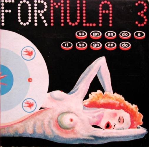
Posted: November 08 2007 at 06:18 |
micky wrote:
here's one from my album collection... great album  .. the cover?... well... let's just say photobucket hates it.... they keep on removing it.. saying it violates the agreement I agreed to...pffff... those pansies need an education in art.... not all art is beautiful hahahha .. the cover?... well... let's just say photobucket hates it.... they keep on removing it.. saying it violates the agreement I agreed to...pffff... those pansies need an education in art.... not all art is beautiful hahahha
|
There is just something just a little creepy about this cover ... top music, though 
|
|
"Without prog, life would be a mistake."
...with apologies to Friedrich Nietzsche
|
|
UltimaPrime
Forum Newbie


Joined: August 31 2005
Location: United States
Status: Offline
Points: 27
|
Posted: November 08 2007 at 04:59 |
|
I'd have to say the cover of 1000 Degrees Centigrades by Magma's sort of a let down, considering the coolness of the music.
Solid gray with black text? Man, that's innovation.
|
|
kenmartree
Forum Senior Member
Joined: October 14 2007
Location: oregon
Status: Offline
Points: 356
|
Posted: November 08 2007 at 01:44 |
Smell the Glove by Spinal Tap, to their credit they didn't draw it up that way!
|
|
Donate monthly and keep PA fast-loading and ad-free forever.
/PAlogo_v2.gif "Progarchives.com Homepage")


 Great Albums Artwork You Hate.


 Whoooaa, mindblowing!!!!