Progarchives redesigned
Printed From: Progarchives.com
Category: Site News, Newbies, Help and Improvements
Forum Name: Welcome newbies!
Forum Description: Introduce yourself and tell us what prog music you listen to
URL: http://www.progarchives.com/forum/forum_posts.asp?TID=89759
Printed Date: February 22 2025 at 11:30
Software Version: Web Wiz Forums 11.01 - http://www.webwizforums.com
Topic: Progarchives redesigned
Posted By: pinksky
Subject: Progarchives redesigned
Date Posted: September 25 2012 at 15:59
Hello, everybody! I listen to progressive rock for over 10 years and it really saved me from my nightmares. Well, I think we all want our website to be the best progressive rock site (as well as now is  ). So I made a preview of how a new redesigned site can look like. For this, firstly I chose the artist page. I attached to post this preview. Some data was reorganized on the page, something was removed, something was moved to other pages. What is your opinion? ). So I made a preview of how a new redesigned site can look like. For this, firstly I chose the artist page. I attached to post this preview. Some data was reorganized on the page, something was removed, something was moved to other pages. What is your opinion?
|
Replies:
Posted By: thellama73
Date Posted: September 25 2012 at 16:13
|
Love it. When is this going to be implemented?
------------- 
|
Posted By: Rune2000
Date Posted: September 25 2012 at 16:36
Great idea!  Take it up with http://www.progarchives.com/Collaborators.asp?id=1" rel="nofollow - M@X and see what he'll think (...or you can try to http://www.facebook.com/maximeroy" rel="nofollow - message him on Facebook ).  ------------- 
|
Posted By: pinksky
Date Posted: September 25 2012 at 16:37
| Thanks. In general, it is only my proposal of a new progarchives. Whether it will use or not - it depends not on me. |
Posted By: thellama73
Date Posted: September 25 2012 at 16:41
|
The best part is no annoyingly cluttered collage banner.
-------------
|
Posted By: Horizons
Date Posted: September 25 2012 at 17:59
|
I like it, though i'm not sure if it's a cluttered banner but i does seem to be missing something to take away from all the purple. :\ ------------- Crushed like a rose in the riverflow. |
Posted By: pinksky
Date Posted: September 25 2012 at 18:19
| Thanks, purple color is a symbol of progarchives. And yes, this colour, on some monitors, looks very poisonous and it would be nice to change a little. |
Posted By: Triceratopsoil
Date Posted: September 25 2012 at 18:24
|
I don't see Abel's banner. Love it. |
Posted By: cstack3
Date Posted: September 25 2012 at 18:26
Nice! Make it so! 
|
Posted By: Atavachron
Date Posted: September 25 2012 at 21:29
|
it is a more elegant design-- you have my support |
Posted By: Horizons
Date Posted: September 25 2012 at 21:32
|
It also has a "Similar Artist" feature right there.. ------------- Crushed like a rose in the riverflow. |
Posted By: Finnforest
Date Posted: September 25 2012 at 21:51
|
It looks good, but benefits greatly from having no ads. Pull all the ads off of our regular page and it looks pretty decent too.
------------- ...that moment you realize you like "Mob Rules" better than "Heaven and Hell" |
Posted By: Ambient Hurricanes
Date Posted: September 25 2012 at 22:01
I like the banner. But the one in Scott's sig is better. ------------- I love dogs, I've always loved dogs |
 thellama73 wrote:
Posted By: Horizons
Date Posted: September 25 2012 at 22:25
|
^ Just kidding :| ------------- Crushed like a rose in the riverflow. |
Posted By: pinksky
Date Posted: September 26 2012 at 03:45
| Well, all things you talking about is easy to add. I can present new version with the banner and ads. |
Posted By: pinksky
Date Posted: September 26 2012 at 13:27
Small updates: added full width prog banner (fused from two wallpapers, for preview) and marked two variable places for banners.
|
Posted By: thellama73
Date Posted: September 26 2012 at 13:34
|
No! We don't like banners. Banners bad!
-------------
|
Posted By: Snow Dog
Date Posted: September 26 2012 at 13:36
|
It's rubbish now, you jst ruined it. ------------- http://www.last.fm/user/Snow_Dog" rel="nofollow"> 
|
Posted By: timothy leary
Date Posted: September 26 2012 at 13:37
| Hate the banner |
Posted By: pinksky
Date Posted: September 26 2012 at 13:37
| But you always can block banners using adblock extensions for your browser. Or you mean progarchives banner? |
Posted By: thellama73
Date Posted: September 26 2012 at 13:39
|
The progarchives banner. I accept that banner ads are a fact of life, and that's fine. But do we have to have an ugly collage as part of the site's logo? -------------
|
Posted By: HolyMoly
Date Posted: September 26 2012 at 13:40
|
As Jim pointed out, there's going to have to be ads in there too eventually, so don't get too attached to the pristine perfection of the model. Very nice, by the way. My wife's a graphic artist and she saw me on PA one day and thought the landing page could use a lot of work. Never bothered me, but some people have an eye for such things.
------------- My other avatar is a Porsche It is easier for a camel to pass through the eye of a needle if it is lightly greased. -Kehlog Albran |
Posted By: Evolver
Date Posted: September 26 2012 at 13:43
|
I like the PA logo. I could do without the collage. ------------- Trust me. I know what I'm doing. |
Posted By: akamaisondufromage
Date Posted: September 26 2012 at 14:04
|
Very much like the typeface and it looks more modern. Don't think the Search function needs to go right across the screen. I would like to see it with the existing logo and smaller search to give it the space. ------------- Help me I'm falling! |
Posted By: pinksky
Date Posted: September 26 2012 at 14:04
| Well, what do you think about new collage? For example, it can be from top 100 prog album covers. |
Posted By: Dean
Date Posted: September 26 2012 at 14:13
|
The MMA and JMA have this pared-down style - I'm not a fan, it looks too dull, too corporate. Nice to see the montage collage disappear, but would have liked to see *something* on the page that couldn't have been designed using Mi©®osoft Paint or modelled in Lego
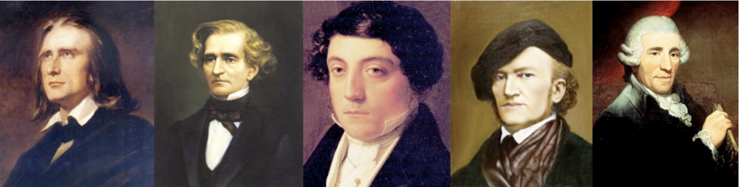
Prog is complexity, layers, fun, puzzlement, intrigue, surprise, psychedelic, loud, difficult, cosmic - it's trippy and out there, it's all flash and no knickers, it's curvaceous and bodacious, sassy and swirly, it's Saturday night not Monday morning, it's not a corporate suit it's jeans and t-shirt and the smell of patchouli and stale beer, it's the sound track of dreams with weird time signatures, odd chord progressions and more key changes than a Student bedsit flat and an overriding sense of precociousness and grandeur. Prog is EPIC.
...of course, having said that, the current design is none of those things either. ------------- What? |
Posted By: rushfan4
Date Posted: September 26 2012 at 14:15
|
I vote for Dean's signature logo as the new logo.
And I like Abel's collage and would miss it if it were removed. ------------- 
|
Posted By: akamaisondufromage
Date Posted: September 26 2012 at 14:18
|
Yep. I would like all that clutter back again. But I would still like the new typeface for the reviews etc makes it easier to read. And Deans Lady Friend too! ------------- Help me I'm falling! |
Posted By: HolyMoly
Date Posted: September 26 2012 at 14:50
------------- My other avatar is a Porsche It is easier for a camel to pass through the eye of a needle if it is lightly greased. -Kehlog Albran |
Posted By: lazland
Date Posted: September 26 2012 at 15:00
Go for it - she might just say yes BTW - I like the collage banner. ------------- Enhance your life. Get down to www.lazland.org Now also broadcasting on www.progzilla.com Every Saturday, 4.00 p.m. UK time! |
Posted By: pinksky
Date Posted: September 26 2012 at 15:08
| So, what do you suggest to add or remove on this preview? |
Posted By: thellama73
Date Posted: September 26 2012 at 15:28
Could we see it in 11/8 with a few Krumhorns, please? -------------
|
Posted By: Epignosis
Date Posted: September 26 2012 at 15:54
Pleased to see I'm not alone in this. ------------- https://epignosis.bandcamp.com/album/a-month-of-sundays" rel="nofollow - https://epignosis.bandcamp.com/album/a-month-of-sundays |
Posted By: Andy Webb
Date Posted: September 26 2012 at 16:11
Ditto, although I like the "slimmed" version in the second preview as well. ------------- http://ow.ly/8ymqg" rel="nofollow">  
|
Posted By: Dean
Date Posted: September 26 2012 at 16:15
|
The collage is not important to the look and feel of the web site, it was a later add-on anyway - go-faster stripes on the hood and fluff dice hanging from the rear-view mirror but it's still a Toyota Corolla.
With or without it I still don't like the attempted redesign. ------------- What? |
Posted By: pinksky
Date Posted: September 26 2012 at 16:18
Sorry, but I don't understand what you mean.
|
Posted By: akamaisondufromage
Date Posted: September 26 2012 at 16:27
Don't concern yourself he's just being facetious. It's a joke - although having said that, there may be some serious intent similar to Dean's comments in that the design should reflect the 'spirit' of Prog is some way whatever that may be! ------------- Help me I'm falling! |
Posted By: Epignosis
Date Posted: September 26 2012 at 16:33
I like Corollas. We used to have one.  ------------- https://epignosis.bandcamp.com/album/a-month-of-sundays" rel="nofollow - https://epignosis.bandcamp.com/album/a-month-of-sundays |
Posted By: HolyMoly
Date Posted: September 26 2012 at 17:02
|
So did I ------------- My other avatar is a Porsche It is easier for a camel to pass through the eye of a needle if it is lightly greased. -Kehlog Albran |
Posted By: Dayvenkirq
Date Posted: September 26 2012 at 17:48
|
To the OP: the theme and fonts are ... OK. Ditto for the banner. I especially like the font for the main text. I don't think it would make the site much more appealing to anyone. The site is fine just the way it is. However, in all honesty, I'm not a big fan of those collage banners. The site could use some work on themes and fonts, since prog excellence is rooted in creativity, (sometimes) resonance, and skill (a judgment based on Dean's comment on the reflection of what prog is about).
|
Posted By: Snow Dog
Date Posted: September 26 2012 at 18:02
|
As long as we never look like MMA I'm fine. ------------- http://www.last.fm/user/Snow_Dog" rel="nofollow">
|
Posted By: Dean
Date Posted: September 26 2012 at 18:07
|
There's far more chance of M@x & Phil adopting a purple variant on the MMA / JMA style than there is of them using a random design posted on the forum. ------------- What? |
Posted By: thellama73
Date Posted: September 26 2012 at 18:16
But there's far more chance of me enthusiastically endorsing a random design posted on the forum. Does my opinion suddenly count for nothing? -------------
|
Posted By: Andy Webb
Date Posted: September 26 2012 at 18:17
|
Question - the artist page looks awesome, but how would the main page look? What would the site look like to someone who's coming here for the first time? ------------- http://ow.ly/8ymqg" rel="nofollow">
|
Posted By: Snow Dog
Date Posted: September 26 2012 at 18:17
Did it ever count for anything? ------------- http://www.last.fm/user/Snow_Dog" rel="nofollow">
|
Posted By: pinksky
Date Posted: September 26 2012 at 18:31
Thank to all for feedback. Yes, I understand that my chances are small, maybe it is just because I am new forum member. But suggesting a new design of website that I use more than 6 years - it is a very exciting and interesting project for me. So I would like to present you all the pages. As was correctly noted, progressive rock is live music, music of human spirit, the essence of creativity and striving forward to new horizons. That's why I chose this way - discussion about the preview (and my point of view) on the forum. Ideas about new design and new features of progarchives must be born in active discussions and disputes. And finally, the proposed design can looks strict and minimalist because it is an encyclopedia site, utilitarian guide used by thousands of people around the world.
|
Posted By: Andy Webb
Date Posted: September 26 2012 at 18:32
Your best chances are to connect with him via email or even twitter or facebook, as he rarely visits his own forum anymore, I'm afraid. Godspeed, though, it's an awesome idea. ------------- http://ow.ly/8ymqg" rel="nofollow">
|
Posted By: pinksky
Date Posted: September 26 2012 at 18:37
| Thanks, I try to connect with M@x afternoon |
Posted By: Dean
Date Posted: September 26 2012 at 19:09
------------- What? |
Posted By: colorofmoney91
Date Posted: September 26 2012 at 19:31
|
I really love the two layouts on the first page of this thread. Seriously great work. Too bad it'll never happen :'( The forum software hasn't even been updated yet, not that it affects the front page design at all. It's just depressing. ------------- http://hanashukketsu.bandcamp.com" rel="nofollow - Hanashukketsu |
Posted By: Padraic
Date Posted: September 26 2012 at 20:35
No, it hasn't counted for some time now. 
|
Posted By: thellama73
Date Posted: September 26 2012 at 20:51
|
One day I will wield influence and then you will all be sorry.
-------------
|
Posted By: Ambient Hurricanes
Date Posted: September 26 2012 at 22:30
Logan for president of PA ------------- I love dogs, I've always loved dogs |
Posted By: AtomicCrimsonRush
Date Posted: September 26 2012 at 22:46
You mean the little ol sig below? Well I like it anyway. As for a new look. If it aint broke why fix it? Seems like a lot of unnecessary hard work to me. Though a new look would be a change of course. i am not into changing everything though. They did it with Youtube and everybody missed the little stars, they did it on facebook and everyone got lost and hated it. PA's look is better than JMA and MMA, too dark and depressing for me, so keep it purple and "keep it safe"... fly, you fools! ------------- 
|
Posted By: Triceratopsoil
Date Posted: September 26 2012 at 23:15
|
Posted By: Dayvenkirq
Date Posted: September 27 2012 at 02:53
| ^ That would look like trying to sell the website. I'd stick with Scott's idea. |
Posted By: Moogtron III
Date Posted: September 27 2012 at 02:56
Well, I'm glad that we have some colour on PA, as opposed to MMA and JMA. I do like the proposed new lay out, though. I'm happy with the old one, but the new one looks more updated. I'm not sure if the collage fits in the new lay out. I do like the collage, and it's proggy, because visuals always have been an important part of prog.
|
Posted By: The Bearded Bard
Date Posted: September 27 2012 at 14:10
-------------  
|
Posted By: NotAProghead
Date Posted: September 27 2012 at 16:24
Unfortunately it's so. I'm happy with current design, I like the collage and, in my opinion, it's better to fix current bugs (some of them are quite annoying) than invent new design. It's like cigarettes - once in 2-3 years companies change the pack's design and with each change tobacco itself becomes worse and worse. From the other hand, some changes are inevitable. More and more people use different kinds of gadgets and many things on PA (like small letters A, B, C... ) are not adjusted for these users' convenience. ------------- Who are you and who am I to say we know the reason why... (D. Gilmour) |
Posted By: Ytse_Jam
Date Posted: September 27 2012 at 18:22
|
Posted By: Chozal
Date Posted: September 28 2012 at 05:00
Me too :( I got used to its cheesiness. Guess we're not very progressive members ... ------------- https://www.facebook.com/pages/The-Infinite-Progability-Drive/141225469388975" rel="nofollow - The Infinite Progability Drive , feeding you daily progressive/weird music for just a like <3 |
Posted By: Snow Dog
Date Posted: September 28 2012 at 05:05
|
^We are. We recognize tat when we see it though. ------------- http://www.last.fm/user/Snow_Dog" rel="nofollow">
|
Posted By: Dean
Date Posted: September 28 2012 at 05:11
|
Recycling is progressive isn't it? ------------- What? |
Posted By: Snow Dog
Date Posted: September 28 2012 at 05:12
Oh good. I do a lot of that.... ------------- http://www.last.fm/user/Snow_Dog" rel="nofollow">
|
Posted By: stonebeard
Date Posted: September 28 2012 at 21:37
|
I really dislike how this site is stuck in 2004. Here's an August 2004 screenshot: http://web.archive.org/web/20040829050342/www.progarchives.com/" rel="nofollow - http://web.archive.org/web/20040829050342/www.progarchives.com/ It's basically the same damn thing with more links added. The site looks like tacky garbage. The content may be good, the people may be interesting. But it's aesthetic is backward-minded, sh*tty design. Sorry, but nostalgic as it may be, it's bad. Also, mobile PA app? What are smartphones? Who needs those with this sweet new Nokia I just bought? The biggest change Prog Archives has made in 8 years has been the addition of 6 or so smiley-faces on the forum.
------------- http://soundcloud.com/drewagler" rel="nofollow - My soundcloud. Please give feedback if you want! |
Posted By: Epignosis
Date Posted: September 28 2012 at 21:43
I disagree. We took a step backward. Robbie Steinhardt was on the front page and now is not??!?  ------------- https://epignosis.bandcamp.com/album/a-month-of-sundays" rel="nofollow - https://epignosis.bandcamp.com/album/a-month-of-sundays |
Posted By: Dayvenkirq
Date Posted: September 28 2012 at 23:43
Oh, sweet. TFTO received a relatively huge number of 5's.
|