just posting some artwork
Printed From: Progarchives.com
Category: Topics not related to music
Forum Name: General discussions
Forum Description: Discuss any topic at all that is not music-related
URL: http://www.progarchives.com/forum/forum_posts.asp?TID=24224
Printed Date: February 21 2025 at 22:23
Software Version: Web Wiz Forums 11.01 - http://www.webwizforums.com
Topic: just posting some artwork
Posted By: Aaron
Subject: just posting some artwork
Date Posted: June 03 2006 at 14:34
|
I went to college for art, but I guess never really thought of myself as an artist. Part of me was thinking of picking up a paintbrush again. Maybe actually do something with it, or maybe just do it as something for myself. Just curious as to how some of you think of it. I guess for the first piece, I think it looks pretty nice. But I guess I agree with my professor on how he said there is some sort of "sweetness" about it that puts you off. It's a weird feeling, it is nice to look at but lacks any oppositional/original motivation. It's just titled "Landscape."
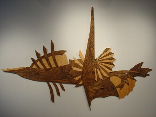  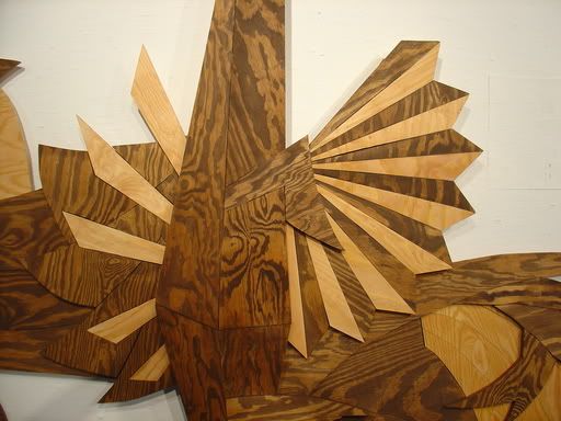 The next one i did a year earlier, kind of Roger Dean Inspired actually, at least the background part with just the two colors. I actually kind of like this one, been thinking of doing things more like this. It was actually in the SUNY student art exhibition. Not exactly a big deal, but they did put a picture of it in one of the exhibtion pamphlets. I don't have a real good picture of this one , the first picture is just sort of thrown together to take a shot of it, the second is just the pamphlet shot, , but not set up the way it should be. The third is how it looks in the house right now. This one is also called "Landscape."
   interested in some feedback
Aaron
|
Replies:
Posted By: R o V e R
Date Posted: June 03 2006 at 14:39
|
hey Aaron
good work man
i like it a lot.
show me some more man,
it is very inspiring,
what were you thinkin, while doing this artwork
bravo man
|
Posted By: stonebeard
Date Posted: June 03 2006 at 14:43
|
------------- http://soundcloud.com/drewagler" rel="nofollow - My soundcloud. Please give feedback if you want! |
Posted By: Man With Hat
Date Posted: June 03 2006 at 14:52
|
------------- Dig me...But don't...Bury me I'm running still, I shall until, one day, I hope that I'll arrive Warning: Listening to jazz excessively can cause a laxative effect. |
Posted By: Aaron
Date Posted: June 03 2006 at 14:59
|
Thanks Rover,
Well, I guess my whole attitude on art is that I won't bother with a social or political agenda. That's why they are just titled "landscape," because that is what they are. I just try to represent them in another way, while still keeping the feeling of vastness.
The first one was literally thought up in my head, drawn on paper, turned it into a wall sculpture. Pretty much all held together with wood glue, hahaha. That one was just ply-wood and stain. I guess it was funny to use ply-wood, but that was just because I was cheap, it didn't have anything to do with recyclable or inexpensive materials to create art. I guess I think that because I don't like the whole "art can be wonderful no matter the quality of materials" approach, especially if that is what is giving you the inspiration. Most of that garbage art that the general masses views as garbage, is garbage in my opinion. Enough on that. I was just cheap.
The idea behind second one started as smaller wood cutout paintings. But I always like working big. It lets the mistakes become less noticeable, haha. That and size does have some sort of quality, small or large. The crisscrossing mountains was just an idea I had. It let the mountains support themselves rather than being a flat painting. Also, the way the mountains blend together is the crisscrossing looks interesting visually. If I can motivate myself to work a little more on this stuff, I will probably continue in this direction.
Aaron
|
Posted By: chamberry
Date Posted: June 03 2006 at 15:24
|
Both look awesome. I like more the first one but its only because I like the color of dark wood (don't ask). I n the second theres clearly a Dean influence. I like it also really. Good stuff. If my mom sees that in a store she would definetly buy it.  ------------- 
|
Posted By: darksinger
Date Posted: June 03 2006 at 15:36
|
very nice! ------------- 
|
Posted By: heyitsthatguy
Date Posted: June 03 2006 at 22:59
|
Is it me or does the first one resemble an airship from the FF series? Awesome work btw
------------- 
|
Posted By: Bj-1
Date Posted: June 03 2006 at 23:37
|
Very cool stuff ------------- RIO/AVANT/ZEUHL - The best thing you can get with yer pants on! |
Posted By: AtLossForWords
Date Posted: June 03 2006 at 23:40
|
God damn that's good. I'd like to make a bass neck out of that beautifull textured hardwood. -------------  
"Mastodon sucks giant monkey balls." |
Posted By: The Wizard
Date Posted: June 03 2006 at 23:41
|
Nice, nice. Very abstract and intresting. Keep up the good work. -------------  
|
Posted By: Arsillus
Date Posted: June 04 2006 at 00:49
|
Hey, that's awesome. I really like it. Must have taken a long time to accomplish.
|
Posted By: Empathy
Date Posted: June 04 2006 at 00:51
|
I especially like the first piece! It reminds me of some strange kind of aquatic evolutionary offshoot. I like how you've added the Boba Fett and Legolas cardboard cutouts for perspective on the second piece.  ------------- Pure Brilliance: 
|
Posted By: Rust
Date Posted: June 04 2006 at 02:16
|
------------- We got to pump the stuff to make us tough from the heart Its astart What we need is awareness we cant get careless Mental self defensive fitness Make everybody see in order to fight the powers that be |
Posted By: Aaron
Date Posted: June 04 2006 at 12:27
|
The first one was my senior project in college, the second one was made two semesters ealier, both were on a time schedule, i'm a procrastinator so there was a lot of crunch time, but I kind of like to work with a deadline. Makes that last few days more exciting.
Aaron
|
Posted By: Aaron
Date Posted: June 04 2006 at 12:28
|
and thanks for the compliments everyone, makes me think differently as to where i should be headed
but I love criticisms as well, that's what i was hoping for
Aaron
|
Posted By: Man Made God
Date Posted: June 04 2006 at 12:34
I really like 'Landscape'. Great work! I could even see that hanging in
my room one day, and I'm not that big of a fan of art  As for the criticism from you professor ("sweetness"), I can agree, but that's just the thing I like about it. ------------- http://www.last.fm/user/manmadegod/?chartstyle=ScarlettJohansson1"> 
Focus on the music... Focus! |
Posted By: Viajero Astral
Date Posted: June 04 2006 at 21:15
Good work  ------------- 
|
Posted By: el böthy
Date Posted: June 04 2006 at 21:24
|
The fisrt one is good...the others I dont like...but its just my opinion... ...if I could I would also post some of my art...in my case drawing ------------- "You want me to play what, Robert?" 
|
Posted By: Rust
Date Posted: June 04 2006 at 22:36
|
Don't know if this is the kind of critisism you want, but I would have painted more clouds, mountains, and a sun on the background of the second one. It would add to the atmosphere that you are going for I think. It has a lot of atmosphere as it is, but a little more detail of the background would help some.
Hoped I helped.
------------- We got to pump the stuff to make us tough from the heart Its astart What we need is awareness we cant get careless Mental self defensive fitness Make everybody see in order to fight the powers that be |
Posted By: cuncuna
Date Posted: June 04 2006 at 22:39
|
I would need to know something about the pieces defore to trhow some "feedback". It looks ok without any conceptual framework to consider. Now, that framework would help me understand the nature of those works, not only their surface. ------------- ¡Beware of the Bee! |
Posted By: Aaron
Date Posted: June 05 2006 at 09:14
It is hard for me to mention more than I have. They are both titled "Landscape," because that is what they are. I believe anyone can view it art however they want, that's why I dont force any more of an idea than how it is supposed to be a landscape. The title fits better with the second one, just because of the obviousness, but with the first I could have come up with something fruity. But the idea behind it was inspired by a landscape, and that's what it is supposed to be. But it isn't just some abstract sculpture where you say to yourself "hey that could be a mountain or that could be the sun or waves or rolling hills and so on." Like I mentioned in a previous post, it represents space and vastness like a true landscape inherently has. I tried to recreate that feeling on something, although large for a sculpture, quite small in comparison to a landscape.
The mountain range piece is more of same approach in the idea of vastness (i really wish i had a good picture of this one). It comes out at you and has a very stage design feel. The mountains blend themselves together with the crisscrossing. Also the background, although flat, peeks out between the cracks and illuminates the rest of the piece, creating space (at least for me, haha).
but view them however you want, they are more or less art for arts sake
hit me with something nasty cuncuna, that's what i like, nothing is more appreciated than a solid experienced criticism
Aaron
|
 cuncuna wrote: