Progarchives.com has always (since 2002) relied on banners ads to cover web hosting fees and all.
Please consider supporting us by giving monthly PayPal donations and help keep PA fast-loading and ad-free forever.
/PAlogo_v2.gif) |
Ugliest covers of otherwise great albums |
Post Reply 
|
Page <1 1011121314> |
| Author | |||
Moyan 
Forum Senior Member 

Joined: February 29 2024 Location: Suffex Status: Offline Points: 1219 |
 Post Options Post Options
 Thanks(0) Thanks(0)
 Quote Quote  Reply Reply
 Posted: April 03 2024 at 20:41 Posted: April 03 2024 at 20:41 |
||
Unlike that one, "Mirage" has a great, iconic sleeve design featuring a camel motif.
|
|||
 |
|||
Easy Money 
Special Collaborator 

Honorary Collaborator / Retired Admin Joined: August 11 2007 Location: Memphis Status: Offline Points: 10617 |
 Post Options Post Options
 Thanks(0) Thanks(0)
 Quote Quote  Reply Reply
 Posted: April 03 2024 at 13:11 Posted: April 03 2024 at 13:11 |
||
|
The story about Rick Wakeman throwing a tomato at a proposed album cover is hardly believable. Who, Wakeman included, walks around with a tomato in their pocket.
|
|||
 |
|||
Cristi 
Special Collaborator 

Crossover / Prog Metal Teams Joined: July 27 2006 Location: wonderland Status: Offline Points: 43626 |
 Post Options Post Options
 Thanks(0) Thanks(0)
 Quote Quote  Reply Reply
 Posted: April 03 2024 at 10:02 Posted: April 03 2024 at 10:02 |
||
why is this one ugly?
 |
|||
 |
|||
Cristi 
Special Collaborator 

Crossover / Prog Metal Teams Joined: July 27 2006 Location: wonderland Status: Offline Points: 43626 |
 Post Options Post Options
 Thanks(0) Thanks(0)
 Quote Quote  Reply Reply
 Posted: April 03 2024 at 10:01 Posted: April 03 2024 at 10:01 |
||
I'm not "reiterating" anything. That's a rude thing to say, like listeners can't figure things out on their own. I think there are 3 good songs on the album, the opener, the close and Release Release. As for GTFO, there are 3 good songs, too. Parallels, Awaken and Wonderous Stories. I never liked the album cover.
|
|||
 |
|||
richardh 
Prog Reviewer 

Joined: February 18 2004 Location: United Kingdom Status: Offline Points: 28028 |
 Post Options Post Options
 Thanks(0) Thanks(0)
 Quote Quote  Reply Reply
 Posted: April 03 2024 at 09:53 Posted: April 03 2024 at 09:53 |
||
I love Alan White's drumming on that album but the cheesy keyboard sounds and lack of any real direction and cohesion to the album overall lets it down massively plus try remembering anything memorable Steve Howe does on that album is tricky to say the least. It's not terrible though.
|
|||
 |
|||
Moyan 
Forum Senior Member 

Joined: February 29 2024 Location: Suffex Status: Offline Points: 1219 |
 Post Options Post Options
 Thanks(0) Thanks(0)
 Quote Quote  Reply Reply
 Posted: April 03 2024 at 09:37 Posted: April 03 2024 at 09:37 |
||

|
|||
 |
|||
Moyan 
Forum Senior Member 

Joined: February 29 2024 Location: Suffex Status: Offline Points: 1219 |
 Post Options Post Options
 Thanks(0) Thanks(0)
 Quote Quote  Reply Reply
 Posted: April 03 2024 at 09:37 Posted: April 03 2024 at 09:37 |
||
It's quite a different thing with that album sleeve. Not only does the Hipgnosis design not match the Yes' music, as was clearly seen in the example of the previous album, but their work used on "Tormato" is far below the level of the "Hipgnosis" group themselves. The urban legend even states that "Tor" was the originally chosen album title, and then that photograph and title, "Tormato," came from Rick Wakeman throwing a tomato at the artwork after viewing an awful and dull design.
|
|||
 |
|||
Nogbad_The_Bad 
Forum & Site Admin Group 

RIO/Avant/Zeuhl & Eclectic Team Joined: March 16 2007 Location: Boston Status: Offline Points: 20847 |
 Post Options Post Options
 Thanks(0) Thanks(0)
 Quote Quote  Reply Reply
 Posted: April 03 2024 at 08:26 Posted: April 03 2024 at 08:26 |
||
|
Oh come on that's a great cover!
|
|||
|
Ian
Host of the Post-Avant Jazzcore Happy Hour on Progrock.com https://podcasts.progrock.com/post-avant-jazzcore-happy-hour/ |
|||
 |
|||
Grumpyprogfan 
Forum Senior Member 
Joined: July 09 2019 Location: Kansas City Status: Offline Points: 11598 |
 Post Options Post Options
 Thanks(0) Thanks(0)
 Quote Quote  Reply Reply
 Posted: April 03 2024 at 08:20 Posted: April 03 2024 at 08:20 |
||
|
Present- This is not the End
|
|||
 |
|||
Cristi 
Special Collaborator 

Crossover / Prog Metal Teams Joined: July 27 2006 Location: wonderland Status: Offline Points: 43626 |
 Post Options Post Options
 Thanks(0) Thanks(0)
 Quote Quote  Reply Reply
 Posted: April 03 2024 at 07:55 Posted: April 03 2024 at 07:55 |
||
Again, not an ugly cover and not a good album.
 |
|||
 |
|||
Octopus II 
Forum Senior Member 

Joined: May 21 2023 Location: UK Status: Offline Points: 10382 |
 Post Options Post Options
 Thanks(1) Thanks(1)
 Quote Quote  Reply Reply
 Posted: April 03 2024 at 07:50 Posted: April 03 2024 at 07:50 |
||
It certainly puts you off your dinner.
 |
|||
 |
|||
rushfan4 
Special Collaborator 

Honorary Collaborator Joined: May 22 2007 Location: Michigan, U.S. Status: Offline Points: 66262 |
 Post Options Post Options
 Thanks(0) Thanks(0)
 Quote Quote  Reply Reply
 Posted: April 03 2024 at 07:44 Posted: April 03 2024 at 07:44 |
||

|
|||

|
|||
 |
|||
Moyan 
Forum Senior Member 

Joined: February 29 2024 Location: Suffex Status: Offline Points: 1219 |
 Post Options Post Options
 Thanks(0) Thanks(0)
 Quote Quote  Reply Reply
 Posted: April 03 2024 at 07:34 Posted: April 03 2024 at 07:34 |
||

|
|||
 |
|||
Moyan 
Forum Senior Member 

Joined: February 29 2024 Location: Suffex Status: Offline Points: 1219 |
 Post Options Post Options
 Thanks(0) Thanks(0)
 Quote Quote  Reply Reply
 Posted: April 03 2024 at 07:34 Posted: April 03 2024 at 07:34 |
||

|
|||
 |
|||
Lewian 
Prog Reviewer 

Joined: August 09 2015 Location: Italy Status: Offline Points: 14728 |
 Post Options Post Options
 Thanks(0) Thanks(0)
 Quote Quote  Reply Reply
 Posted: April 03 2024 at 06:53 Posted: April 03 2024 at 06:53 |
||
|
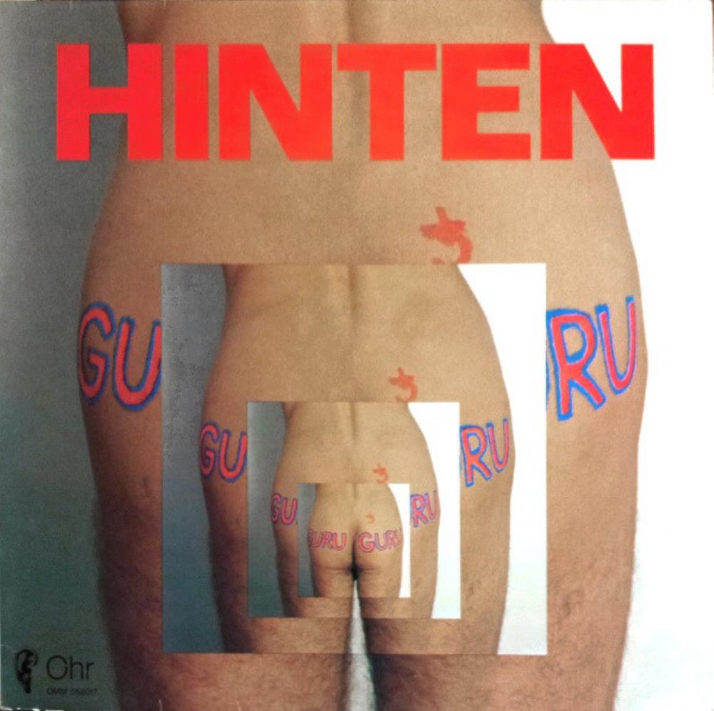
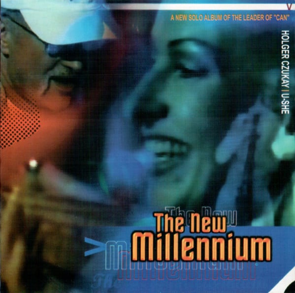
Some Holger Czukay covers are bad in an "oh I still need a cover for the new album; I just take the first photo that I find on my desk and put some 5 minutes of design on top of it" kind of way. He has a few good ones though (for example my avatar).
This one for example is quite a car crash.  Edited by Lewian - April 03 2024 at 06:57 |
|||
 |
|||
Moyan 
Forum Senior Member 

Joined: February 29 2024 Location: Suffex Status: Offline Points: 1219 |
 Post Options Post Options
 Thanks(0) Thanks(0)
 Quote Quote  Reply Reply
 Posted: April 03 2024 at 06:41 Posted: April 03 2024 at 06:41 |
||
Oh, and I would add the "Tormato" cover as well, because I consider that album to be the last Yes classic masterpiece with a disaster sleeve design. |
|||
 |
|||
Psychedelic Paul 
Forum Senior Member 

Joined: September 16 2019 Location: Nottingham, U.K Status: Offline Points: 40087 |
 Post Options Post Options
 Thanks(0) Thanks(0)
 Quote Quote  Reply Reply
 Posted: April 03 2024 at 05:24 Posted: April 03 2024 at 05:24 |
||
|
That dreadful Kevin Rowland album cover makes me want to barf. There's no way I'd ever buy that album, even if I was a fan.

|
|||
 |
|||
Cristi 
Special Collaborator 

Crossover / Prog Metal Teams Joined: July 27 2006 Location: wonderland Status: Offline Points: 43626 |
 Post Options Post Options
 Thanks(0) Thanks(0)
 Quote Quote  Reply Reply
 Posted: April 03 2024 at 05:10 Posted: April 03 2024 at 05:10 |
||
The thread title says "ugliest covers". Are those two covers "ugly" or "ugliest"? I don't think so. I don't think the Rush cover is special in any way, but "ugly"?! Not at all.
|
|||
 |
|||
Moyan 
Forum Senior Member 

Joined: February 29 2024 Location: Suffex Status: Offline Points: 1219 |
 Post Options Post Options
 Thanks(0) Thanks(0)
 Quote Quote  Reply Reply
 Posted: April 03 2024 at 04:30 Posted: April 03 2024 at 04:30 |
||
Rush's "2112" cover, in my opinion, is a very shoddy, cheap, and uninspired design. As for Steve Hillage's "Motivation Radio," for instance, the "L" cover also depicts Hillage with his Stratocaster and enigmatic lights behind him, but the photo and design are wonderful. In comparison, "Motivation Radio" seems kitsch. |
|||
 |
|||
Cristi 
Special Collaborator 

Crossover / Prog Metal Teams Joined: July 27 2006 Location: wonderland Status: Offline Points: 43626 |
 Post Options Post Options
 Thanks(1) Thanks(1)
 Quote Quote  Reply Reply
 Posted: April 03 2024 at 03:20 Posted: April 03 2024 at 03:20 |
||
|
Nothing wrong with those two covers above...

|
|||
 |
|||
Post Reply 
|
Page <1 1011121314> |
| Forum Jump | Forum Permissions  You cannot post new topics in this forum You cannot reply to topics in this forum You cannot delete your posts in this forum You cannot edit your posts in this forum You cannot create polls in this forum You cannot vote in polls in this forum |