Progarchives.com has always (since 2002) relied on banners ads to cover web hosting fees and all.
Please consider supporting us by giving monthly PayPal donations and help keep PA fast-loading and ad-free forever.
/PAlogo_v2.gif "Progarchives.com Homepage") |
|
Post Reply 
|
Page 123 5> |
| Author | ||
M@X 
Forum & Site Admin Group 
Co-founder, Admin & Webmaster Joined: January 29 2004 Location: Canada Status: Offline Points: 4049 |
 Topic: New site header design, thanks to ABEL ADAMES Topic: New site header design, thanks to ABEL ADAMESPosted: October 12 2010 at 13:51 |
|
|
Hi fellow proggers !!!
Good news! Today I put the new site header design, a prog collage created by our friend Abel Adames. Have a look and post your comments here.  Nice job Abel Nice job Abel |
||
|
Prog On !
|
||
 |
||
|
SaltyJon
Special Collaborator

Honorary Collaborator Joined: February 08 2008 Location: Location Status: Offline Points: 28772 |
Posted: October 12 2010 at 13:52 |
|
|
Just saw it, looks good!
 Thanks, Abel! |
||

|
||
|
||
|
Snow Dog
Special Collaborator

Honorary Collaborator Joined: March 23 2005 Location: Caerdydd Status: Offline Points: 32995 |
Posted: October 12 2010 at 13:53 |
|
|
I was told that if you can't say something nice...........
|
||

|
||
|
||
|
Snow Dog
Special Collaborator
Honorary Collaborator Joined: March 23 2005 Location: Caerdydd Status: Offline Points: 32995 |
Posted: October 12 2010 at 13:54 |
|
|
.....in other words I don't like it.
|
||
|
|
||
|
||
|
harmonium.ro
Special Collaborator
Honorary Collaborator / Retired Admin Joined: August 18 2008 Location: Anna Calvi Status: Offline Points: 22989 |
Posted: October 12 2010 at 13:54 |
|
|
Haha that's fun, bavo!
|
||
|
||
|
M@X
Forum & Site Admin Group
Co-founder, Admin & Webmaster Joined: January 29 2004 Location: Canada Status: Offline Points: 4049 |
Posted: October 12 2010 at 13:55 |
|
 |
||
|
Prog On !
|
||
|
||
|
Snow Dog
Special Collaborator
Honorary Collaborator Joined: March 23 2005 Location: Caerdydd Status: Offline Points: 32995 |
Posted: October 12 2010 at 13:57 |
|
Sorry [email protected] asked for comments. Did you just want positive ones? Oh God.....I've upset M@X now!
 |
||
|
|
||
|
||
|
M@X
Forum & Site Admin Group
Co-founder, Admin & Webmaster Joined: January 29 2004 Location: Canada Status: Offline Points: 4049 |
Posted: October 12 2010 at 13:59 |
|
|
^ no no no , I am not upset, I just wonder what you don't like (more precisions, to help improve maybe)
 |
||
|
Prog On !
|
||
|
||
|
toroddfuglesteg
Forum Senior Member 

Retired Joined: March 04 2008 Location: Retirement Home Status: Offline Points: 3658 |
Posted: October 12 2010 at 13:59 |
|
|
Will this be released as banners which we can use for our own websites too, M@X ? The current banners are rather toothless compared to the new design you have just implemented to my satisfaction/joy. Please remove your current banners and use the new heading as banners. ............. Did I mention I like the new heading ? No ? Well, it has my thumbs up. Edit: Your current banners are squirrel droppings awful, M@X. Please use the new design, compact it a bit and release it as the new banners. Edited by toroddfuglesteg - October 12 2010 at 14:03 |
||
|
||
|
Snow Dog
Special Collaborator
Honorary Collaborator Joined: March 23 2005 Location: Caerdydd Status: Offline Points: 32995 |
Posted: October 12 2010 at 14:03 |
|
Ok....From a design point its not as clean or neat looking now, The PROG ARCHIVES gets lost in the background. The background itself doesn't seem very high res either. The third point is more personal in that I am not a huge fan of collages I hope thats better!
 |
||
|
|
||
|
||
|
Epignosis
Special Collaborator

Honorary Collaborator Joined: December 30 2007 Location: Raeford, NC Status: Offline Points: 32552 |
Posted: October 12 2010 at 14:07 |
|
|
It often takes me a while to warm up to changes when I am used to something, but I seem to quite like this.
My only concern is to be sure using the various images is not a legal problem (I know this has been discussed with respect to Abel's collages themselves, but I just wanted to be sure about the images being used as a heading for a website). But yes, I do like it. |
||
|
||
|
snobb
Special Collaborator

Honorary Collaborator Joined: August 20 2009 Location: Vilnius,LT,EU Status: Offline Points: 3584 |
Posted: October 12 2010 at 14:09 |
|
|
I like this new one

Old one was really.... old-fashion one, and too serious for my taste |
||
|
||
|
Snow Dog
Special Collaborator
Honorary Collaborator Joined: March 23 2005 Location: Caerdydd Status: Offline Points: 32995 |
Posted: October 12 2010 at 14:10 |
|
|
I'm in the minority again.

|
||
|
|
||
|
||
|
rushfan4
Special Collaborator

Honorary Collaborator Joined: May 22 2007 Location: Michigan, U.S. Status: Offline Points: 66582 |
Posted: October 12 2010 at 14:13 |
|
|
||
|
||
|
||
|
lazland
Prog Reviewer 

Joined: October 28 2008 Location: Wales Status: Offline Points: 13791 |
Posted: October 12 2010 at 14:21 |
|
|
Yep, like it
Robert, though, has introduced a note of caution - don't get yourself sued M@X, we sure would miss this place  |
||
|
Enhance your life. Get down to www.lazland.org
Now also broadcasting on www.progzilla.com Every Saturday, 4.00 p.m. UK time! |
||
|
||
|
Shevrzl
Forum Senior Member

Joined: July 27 2009 Location: OP Status: Offline Points: 316 |
Posted: October 12 2010 at 14:22 |
|
|
Not really, I prefer the old one too. This new one seems err... too colourful? Sort of being too prominent. |
||
|
||
|
Marty McFly
Special Collaborator

Honorary Collaborator Joined: March 23 2009 Location: Czech Republic Status: Offline Points: 3968 |
Posted: October 12 2010 at 14:23 |
|
Ian, Ian. But ProgArchives name isn't lost in the background. This orange monster is virtually shining there. Indeed, I have moderate brightness setting on my laptop. With 1280x800 resolution, it's big enough, but you're right that it's not that sharp as it could have been. But I'm fan of sharpened images. Not extremely, but on sharp <=> blurry scale I'm more inclined to sharp point of view. I'm not sharp dressed man though. And third one, I enjoy collages. M@X ? Were you thinking about my suggestions, particulary the one about moving genres / popular bands / alphabetical listing of artists into combo boxes ? It can save a lot of space.
|
||
|
There's a point where "avant-garde" and "experimental" becomes "terrible" and "pointless,"
-Andyman1125 on Lulu  Even my |
||
|
||
|
Chris S
Special Collaborator

Honorary Collaborator Joined: June 09 2004 Location: Front Range Status: Offline Points: 7028 |
Posted: October 12 2010 at 14:23 |
|
|
Love it......great refresh and most prog lovers will immediately identify with the imagery.
|
||
|
...As I venture through the slipstream, between the viaducts in your dreams...[/COLOR] |
||
|
||
|
Logan
Forum & Site Admin Group
Site Admin Joined: April 05 2006 Location: Vancouver, BC Status: Offline Points: 37107 |
Posted: October 12 2010 at 14:39 |
|
|
As Rob pointed out, as long as it does not violate any copyrights for images, then it's fine (I think under fair dealing/ fair use legislation it's acceptable). I would rather the Prog Archives: Your Ultimate Prog Rock Resource" logo thing stood out more rather than having it blend in so much (I would either lighten or darken the area around it or highlight it more in some manner). I also find the collage too busy for my tastes, especially around the "Prog Archives" part. Too many men in the picture too (including man hiney). Personal preference, I'd rather see more females (Gabriel in a dress, and there's a similar other one, doesn't cut it) or non-people things. Though this would have been nice worked into it:
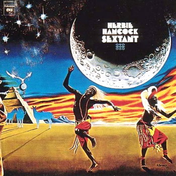 Wouldn't expect it, but I'd rather something more original that captures the spirit of Progressive Music somehow. Maybe something a little shocking/ disturbing/ bizarre like a brain or two wearing headphones. One brain is electrically charged, and one is exploding (this is your brain on Prog) Then we could have some guy screaming rather like the King Crimson cover while someone else is laughing. Or, I'd like and angels and demons scene where the angels and demons are dancing on broken vinyl records. Or some good trip/ bad trip imagery. But that's just me. |
||
|
||
|
Finnforest
Special Collaborator
Honorary Collaborator Joined: February 03 2007 Location: The Heartland Status: Offline Points: 17249 |
Posted: October 12 2010 at 14:47 |
|
I'm with you Snowie, just because i happen to like traditions and classic brandings/logos. Nothing against the artist Abel.
I love old buildings too, and how many Eurpean towns and cities maintain their classic look architectural streetfronts. Here in the States, everything looks like just another Applebees.
|
||
|
...that moment you realize you like "Mob Rules" better than "Heaven and Hell"
|
||
|
||
|
Post Reply
|
Page 123 5> |
| Forum Jump | Forum Permissions You cannot post new topics in this forum You cannot reply to topics in this forum You cannot delete your posts in this forum You cannot edit your posts in this forum You cannot create polls in this forum You cannot vote in polls in this forum |


 New site header design, thanks to ABEL ADAMES
 Topic Options
 Snow Dog wrote: